Eye-Tracking
Navigation UX Audit

Understanding Scan Path Patterns
in London’s TFL Public Transport UI
Project Overview
This UX research study used eye-tracking to analyze user interaction patterns on the Transport for London (TfL) Journey Planner. The aim was to uncover where visual friction, distraction, or inefficiency occurs during route planning, particularly when ad clutter and information density impact visual scanning. Our findings can inform better design decisions for mobility platforms that rely on clarity, hierarchy, and time-sensitive comprehension.
My Role
Conducted lab-based eye-tracking sessions
Analysed fixation data, scanpaths, and regressions
Mapped findings to UX heuristics and interface strategy
Led eye-tracking data analysis and interpretation
Synthesized gaze data into UX breakdowns
Mapped key friction points to visual hierarchy flaws
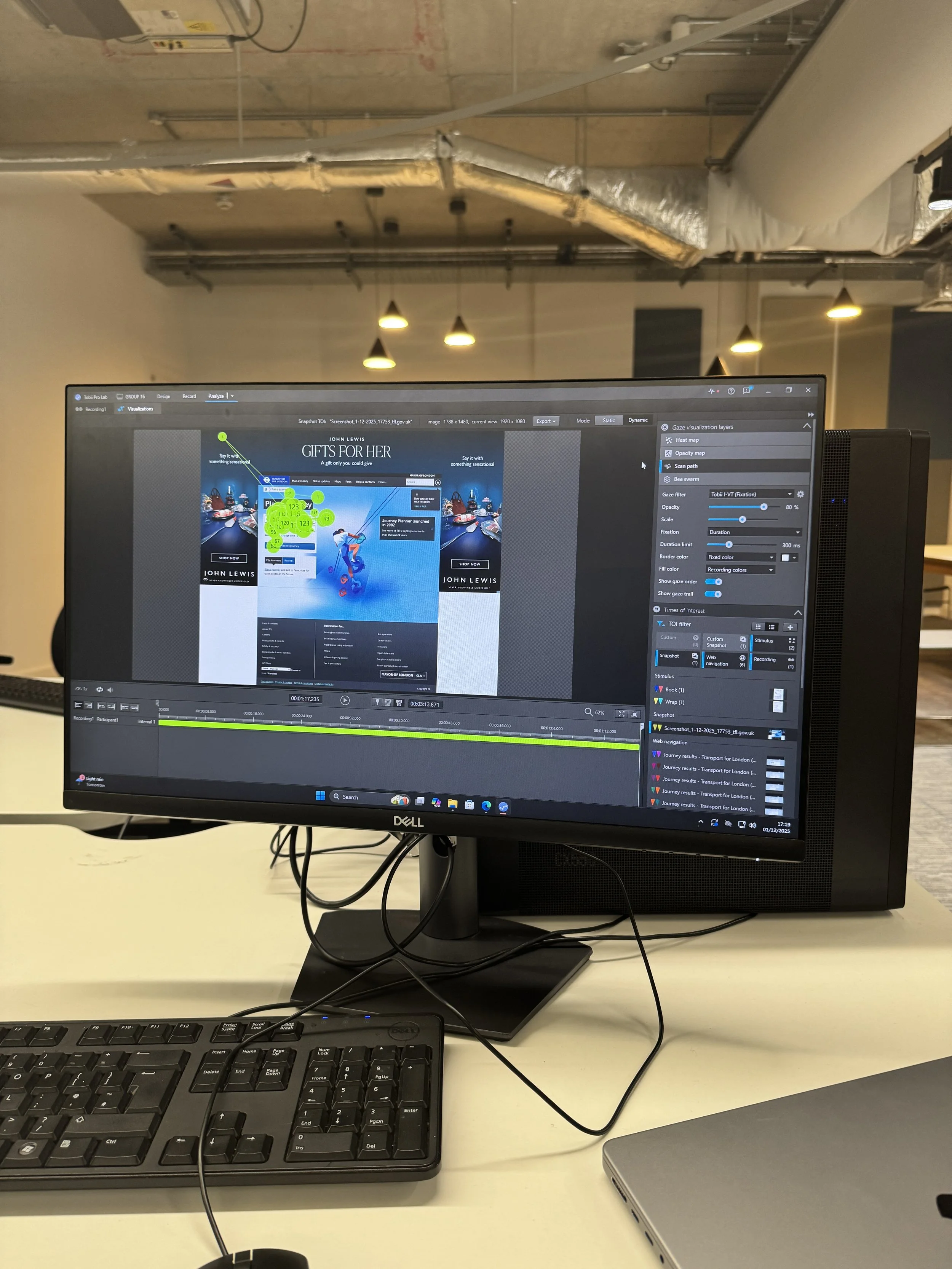
Calibrated and operated Tobii Pro Lab for gaze capture and scan path visualization
Analyzed fixation sequences and gaze clustering to detect areas of visual inefficiency
Co-authored design recommendations for usability improvement
Research Question
How do users visually engage with transit planning tools under real-world task constraints, and what do scan path patterns reveal about visual hierarchy and friction?
Objectives
Capture and visualize user gaze data across task stages
Compare eye movement efficiency between interface conditions (e.g., ad clutter vs clean layouts)
Identify breakdowns in layout flow, visual noise, and user confusion
Translate gaze behaviors into concrete UI recommendations
Methodology
Participants: 5 (pilot study phase)
Tool: Tobii Pro Lab (static and dynamic visualizations enabled)
Stimuli: Transport for London Journey Planner (desktop site)
Procedure:
Participants were asked to complete a transit search using TfL Journey Planner (e.g., British Museum to Big Ben)
Gaze data collected with scan path, fixation duration, and gaze order layers
Data visualized and compared across multiple interface segments (homepage, results page)
Data Analysis Highlights
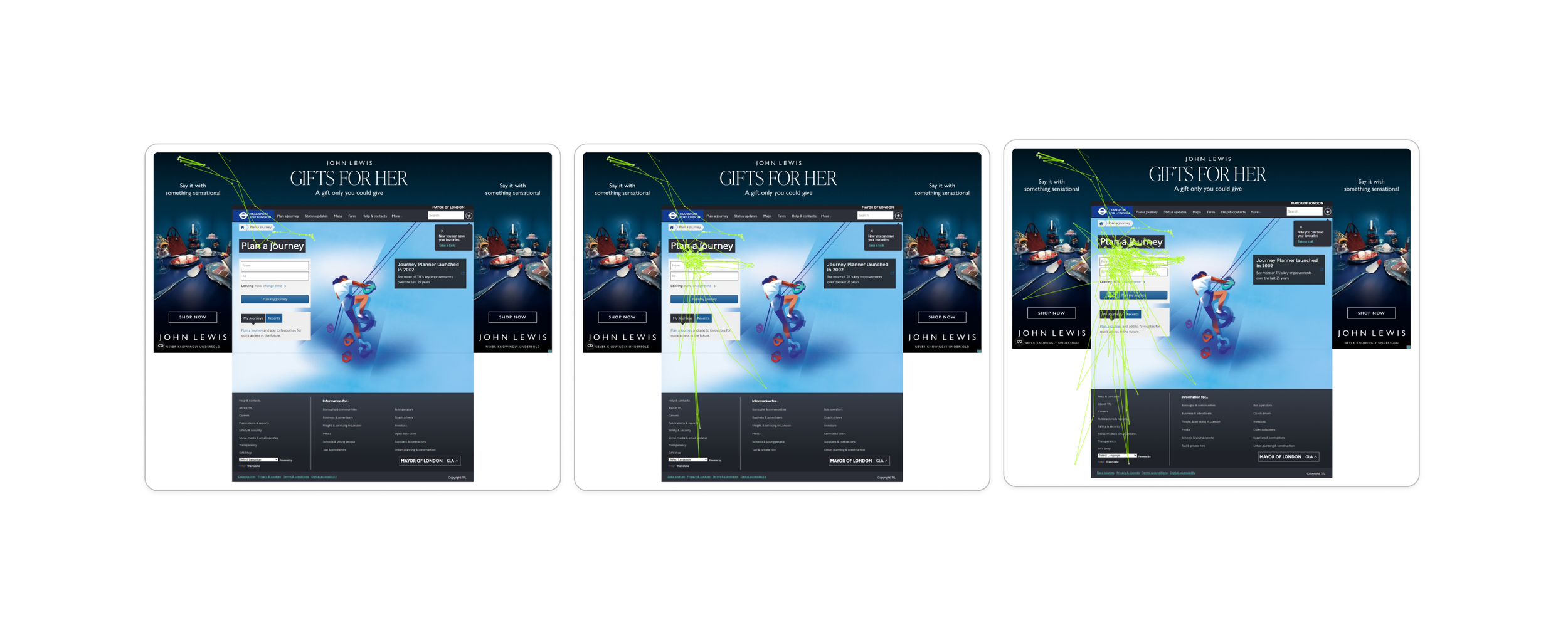
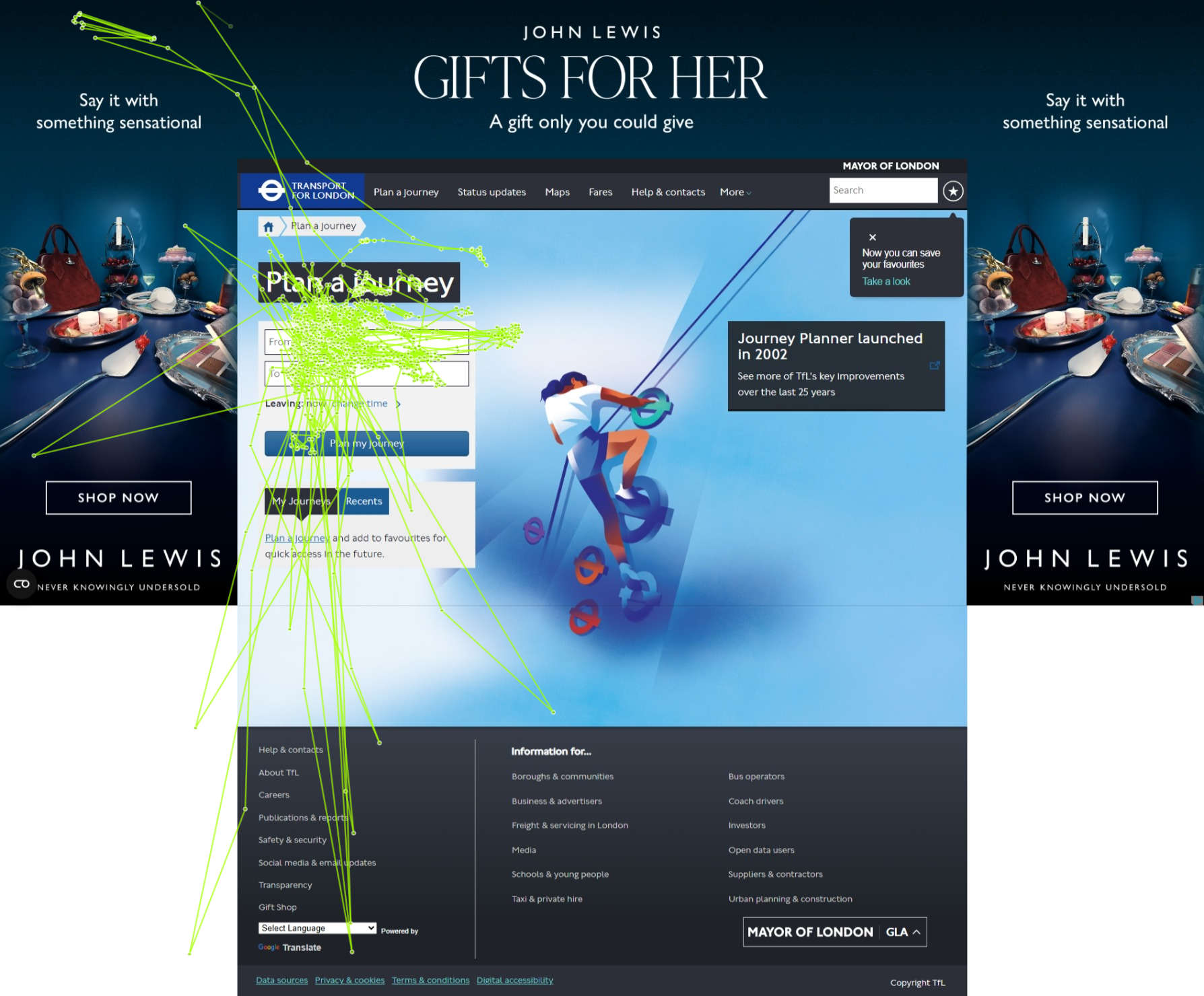
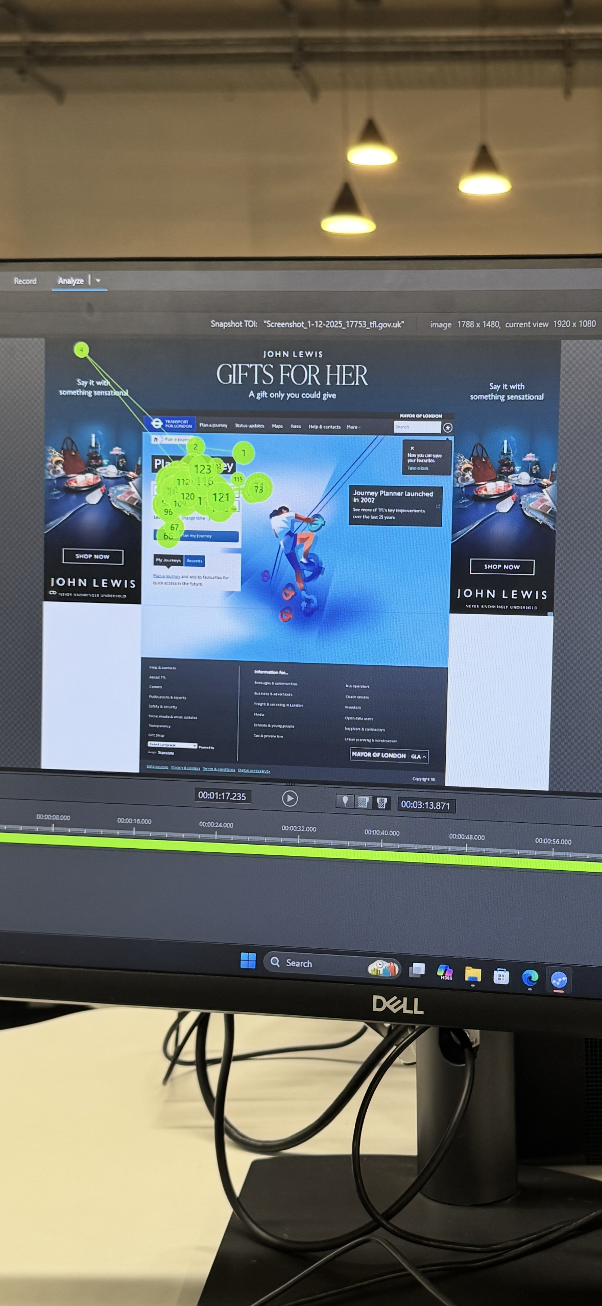
Scan Path Maps
High-density fixation clusters around ad imagery and header navigation — indicating cognitive drift
Eye path zigzagging across unrelated elements before locking onto task-critical content
Fixation Sequence Mapping
Several participants showed inefficient re-scanning of form fields
Search field gaze often interrupted by sidebar ads or floating pop-ups
Gaze heatmaps suggested high engagement with irrelevant imagery (John Lewis banner)
Key Findings
Visual distractions (ads, background visuals) significantly disrupt scanning efficiency
Users expend excess visual effort locating basic route results and filters
Form fields lack visual salience, leading to delayed task completion
Eye-tracking confirms usability issues that might not surface in post-task self-reports
UX Design Implications
For Mobility Platforms (e.g., TfL, Citymapper, Moovit):
Improve contrast and grouping for core input fields
Reduce or isolate non-essential visual elements that fracture gaze paths
Reinforce linear flow from input → confirmation → output
Test interfaces in visual-context simulations, not just flat mockups
Reflection
This project showed the unique value of eye-tracking as a diagnostic tool for visual UX inefficiency. Even well-established services like TfL can benefit from deeper scrutiny of how real users scan, pause, and get interrupted on screen. Interface friction is not always obvious until you see it through users’ eyes — literally.
Tools Used
Tobii Pro Lab (Fixation Sequence Map, Scan Path, Heatmap Layers)
TfL Journey Planner (Desktop Site)
Gaze Trail Analysis & Manual Segmentation